|
Johnny Tek is letting poor layout and design really negatively affect his overall decent product.
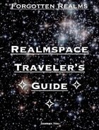
First up Johnny, as someone that bought your first book in this now series, you need to up-your-cover-game. It wasn't clear in your first book that you meant to do it as just "The Primer" to Realmspace, which it seems you did as Chapter 1 is all about "The First Planet, Anadia."
But then your interior layout again is crap. It looks like you're using a landscape style I guess, and just very simple design. You have nice artwork, that again, I assume is your own, but its really lost on just almost difficult to read layout.
At a bare-minimum, you should download the Adventure Template, http://www.dmsguild.com/product/170830/DMs-Guild-Creator-Resource--Adventure-Template and use its two column design.
Also, your cover should...
A) Announce this is Chapter 1. The cover images are used more than the titles almost to help distinguish your book from others. So when you do have 10 of these, I don't need to read the titles but can clearly see "Realmspace Traveller's Guide -- Chapter I" vs "Chapter X" etc.
B) Should really have that nice DMsGuild & Logo on it some place.
C) Use a better font/layout/design. In the PDF, if I tried to print this out, you have a portrait layout with a Landscape page design, so I will have 2 inch columns of white on the page. (and yes, people print out PDFs for reference at table etc).
PS - you might want to consider talking to Travis Jay Proser on Facebook, he has the "rules" your "setting" needs to make this a GREAT set of product.
|